

I have spent the last couple of weeks reviewing your comments and suggestions regarding the photographs to be used in the Artwork for our upcoming album of songs that we performed from our balcony during the first 16 weeks of the pandemic here in the U.K. It has been really useful to me and George to get your opinions which have helped us to narrow down our focus and work towards the final selection.
Having the combined experience of so many contributors has made the task so much easier. The concerts we performed were our contribution to our local community and through the use of streaming software, I found that we could share the experience with you, my friends, and supporters here on my blog. It somehow seemed fitting that you should also be involved in the finalisation of this project, this shared experience, and I want to thank you all for being so supportive through what has been a particularly troublesome time for so many people.
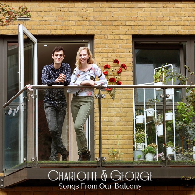
Having listened to your suggestions I chose the three photographs that seemed to encompass as many of the points raised as possible. Finding the best crop, making sure the verticals were correct, that the image included the balcony, and hopefully still shows the enjoyment we got from performing each week.
So here are the final photographs. I have added the typography and tried different positions and backgrounds. Take a good look over each one, let me know your thoughts and together I hope we can pick the final image that I can send off with our tracks for publication before next week’s post.


Lovely concerts and lovely that you were able to do them from your home 😎😎
Thank you, Les, we enjoyed doing the concerts. We’re taking on as much alternative work as we can whilst still picking up any musical bookings going, our online lessons with specialists have been an excellent opportunity created from lockdown.
Best wishes
Charlotte
The first three are great. The buildings in the background are perfect and are not at all a distraction. Both of you look really good in the photograph. I like the keyboard along the bottom and the color type with your names works really well in the first image.
I’m glad you liked them, Timothy, I like the buildings and colour too. Perhaps the keyboard would look better white to match the top. I guess I could always put small boxes of any photos not chosen on the reverse.
Best wishes
Charlotte
You might consider putting your other favorites in a grid on the back screened back, and have your list of songs, credits, legal, etc. over the grid of photos.
I vote for #7
Thank you, Patricia, I like that one too.
Best wishes
Charlotte
WOW, you two really made it tough on us!! I went back and forth over them, trying to get the best and easiest eye-catching photo…. AND I still can’t decided. My vote is split between 5 & 6.
Now – I can go back and see what everyone else voted for (I didn’t want to be influenced. haha)
Yeah, GP, I didn’t look either. I went with 6, but they’re all good.
My Mum liked number 5 but with the names more central. I’ve found all the comments beneficial I’m so glad I got the feedback.
Best wishes
Charlotte
That’s because we care.
Has to be photo 7 for me, love the photo and the text is readable. Photo 2 is also good. Good luck picking the final photos for your album xx
Thanks, Christine, it’s helped me to make my decision to get everyone’s thoughts.
Best wishes
Charlotte
1 to 3 are perfect. You two are facing the camera (and the viewer) and one sees your “public”, the facing buildings. Perfect.
Thank you I think I may have put people off with the keyboard, maybe it should have been white instead of ivory.
Best wishes
Charlotte
The ivory keyboard is fine. Don’t worry. Take care Charlotte. Bonne semaine.
I loved them all but think 4 and 7 stand out more. Fabulous! 👏👏🥰😘
Thanks, Gill glad you liked them, I got in trouble with Mum for not tidying up the flowers in 7. Lol.
All my best wishes to you and Terry,
Charlotte x
I vote for no 4. The look into the distance rather than at the camera just looks a bit more artistic to me, suiting the material. They are all good though.
Thank you 😊. I wasn’t sure about the names on that one going across the balcony and window but I’m happy you liked it.
Best wishes
Charlotte
Wow, difficult choice! I think I will have to go with 1 or 6. I do like that middle photo a lot, and i think it would work fine, but for some reason the two where you are looking at the camera struck me more. For the first set, I do like the red text better. For the last two, for some reason 6 just looks like an album cover to me, while 7 is a nice photo with text beneath it. Any that you chose will be great!
Thanks, Trent, I may have a look at zooming 6 or 7 in a bit more. I may also play around with the typography on the brickwork on that one.
Best wishes
Charlotte
I prefer 6 and or seven depends on font colour … I enjoy seeing the balcony ☺️💫 congrats have a creative day ~ smiles hedy
Thanks, Hedy, we could have a look at what dark red letters look like to match the poppies.
Best wishes
Charlotte
I would choose # 6.
Thank you I appreciate your feedback.
Best wishes
Charlotte
It was so hard to pick a favorite here! I am partial to #7 myself. They are all beautiful!
Thanks, Lavinia, I’m happy you like the photos they were for a pre-wedding photoshoot I’d arranged, we’ve had to put the wedding back again, so it was good not to waste the session.
Best wishes
Charlotte
Wow, great work. For me #3. But all are nice.
Best thoughts for you !!!!
Merci Pascal, I’m thankful for your feedback as always 😊.
Best wishes
Charlotte
I like number seven
Thank you, John, I appreciate your feedback.
Best wishes
Charlotte
Love #7! 🌸
Thank you, Holly, I’m grateful your feedback.
Best wishes
Charlotte
Same to you Charlotte!
Hmm…I like the close-up shot in No.4. ..but I like the balcony shot in No.7. I just wish No.7 was zoomed in a bit more.
I will try zooming it a little more Eric thank you for your feedback.
Best wishes
Charlotte
I like numbers 6 and 7 – they get the whole balcony ambiance. I think in terms of the printing, I do like 6, but both are just great!
Thanks, Noelle, I appreciate your feedback. You know how difficult this is choosing from your book covers.
Best wishes
Charlotte
You always doubt yourself – I love to get feedback from fellow bloggers. How are you guys doing? Getting out and about now? I heard that there’s been a resurgence of Covid in the UK.
#7
Thank you, Annette, I appreciate your feedback.
Best wishes
Charlotte
#4! ❤️
Thank you, Karen, I appreciate your help, if I was a bit more trendy I could have done a graffiti header on the wall lol.
Best wishes
Charlotte
Picture #3 gets my vote, yet I like the balcony too. So #3 and #7. Will you do a digital album too?
Thank you Caroline, yes most of the albums will be digital on Amazon, iTunes and the streaming services the digital music distributor sorts all that out. We will order just a limited number of physical cds.
Best wishes
Charlotte
So sweet ❤️
Good morning
Thank you Amritpal, hope you have a super weekend.
Best wishes
Charlotte
Number 5 😊
My Mum’s favourite too Elisabeth 😊.
Best wishes
Charlotte
Each photo is beautiful and together you look great!!!
I adore the picture No.6
Thank you, Konstatina, I like that one too.
Best wishes
Charlotte
Very hard to choose, they are all lovely.
I think my choice is no 7. I hope you have loads of sales, you certainly deserve it.😘😘👏🏻👏🏻👏🏻
Aww thank you 😊. We are happy with the songs we chose and we hope you like them too. Speak soon x.
Best wishes
Charlotte
My vote goes to #2. The composition of both of you just right i.e. does not show too much of the lower part to see hands and rail supports. I also like bright and colorful colors than balcony set. I guess it also depends on what you intend to use it for too.
The image will be used on the front and the back of the cd artwork, someone gave me the idea of using the images we don’t choose for the front in little squares on the back where you put the name of the songs. It was good to show a little of our view when we were singing.
Best wishes and thank you for your thoughts,
Charlotte
Picture No.6 or 7 – a more relaxed version of you two that has the balcony in it. Setting the context and not having an overly posed couple makes it work! All the best to you both!
Thank you Paul, yes it does have a nice feel to it. It was a fun photoshoot very relaxed Lloyd was doing a pre-wedding shoot for us, sadly the wedding has been postponed again with the new lockdown but at least the photo session will be useful as well.
Best wishes
Charlotte
I’m going with 4, although I believe you should pick the one you think best represents the songs you’ve selected as well as the time and place reflected in your experience. Any one is great – I did like the piano addition plus I like the balcony to appear more prominent because it was the impetus for your songs.
Good luck!
Thank you for your feedback Sheila, with hindsight we should have moved the piano back out onto the balcony, but it was such a maul unscrewing it off its indoor stand and putting it on the travelling stand we have, hence why I thought of the false piano keys, I should have tried it out with white keys too I think.
Best wishes
Charlotte
Whatever you choose will be brilliant.
Don’t judge me. I thought that I would like the pictures of y’all on your balcony, but… It’s number 3. The background is so light, bright and colorful that it carries the cover. It makes me smile. Your portrait is friendly. The only suggestion I have is to make your names bolder and maybe larger type. The bottom text is very good.
One more piece of advice. Don’t listen to any of us and do what you want. Your names are on this. The CD represents you.
Besides, do you know how the color beige came to be? God worked very hard for six days. He/She created all the wonderful color in the world. He was tired. He gathered the saints together and said, you decide the final color. They talked and argued and finally came up with a group decision. Beige.
Be well, Ray
Lol 😂 Ray I loved that. I hardly have any beige in my life. I loved the colours of the buildings too, being a rainbow 🌈 girl. I got in trouble off my Mum for not sorting out the plants on the balcony before the photo, I considered getting my Dad to photoshop them 😃.
We are more confident with our song choices but a cd cover image does help to promote digital downloads and listens even though its only usually a small square people see on Amazon, iTunes or Spotify.
Thanks for taking the time to let me know your thoughts Ray I appreciate it.
Best wishes
Charlotte
My pleasure. Of course. That’s the reason to make a cover. That said, don’t forget to market your CD on all socials at least 5 or 6 times each. And, ask for reviews especially from your neighbors. One more thing, since I deal with this always. You do know that all three of those platforms have different mastering standards, yes?
Best, Ray
Yes, I believe our digital music distributor sorts all that out for us once we submit the recordings and cd art.
Number 6. Best balance. Many good choices, but that’s the one I like best.
Thank you Jeff, my brother suggested a little bit of white text on the black of the balcony saying recorded during the Covid19 lockdown … or something like that with white text, we will play around a little more I’m grateful for your thoughts.
Best wishes
Charlotte
These all sing out, which is great and you both look great in all of them. The font with your names is really attractive. Edwin liked 2 and 5 best. I like the backgrounds in 1, 2 and 3 best and I think they look the most professional. However, see my more detached view of some details below.
The background in I, 2 and 3 feels most spacious and inclusive. The keyboard idea is great, but I don’t think the it works visually as it eats up the subtitle letters and, although they are clearer in no 3 the shaded background panel doesn’t look so good. Your expressions in 4 and 5 are very sweet, but in 4 the text is compromised by the background. In no 5 the subtitle is beautifully clear against the music stand, but your names are a little lost, though . Am I the only one to feel that both 5 and 6 have a just a whiff of the pub about your names – The Charlotte and George? 7 is great, but the text needs to stand out a bit more.
With any luck you have made your decision by now and can ignore my nit-picking – they are wonderful covers!
No we’ve not chosen yet Hilary I’m just reading through all the comments tonight. I’m still thinking about it, George is preparing for a competition so he’s practicing every hour. I’m glad you commented on the typography I wasn’t sure about it, there are quite a number of pubs called The George lol. My Mum told me off for not sorting out the fading plants in that photo 😂. Then she complained we hadn’t put the piano out on the balcony so your comments are very mild.
I always prefer true thoughts that’s why I asked I actually do take on board what everybody says, its hard to figure all this out for ourselves, my brother Tom did graphic design at school and one of the modules was cd design I must get him to look over them and see if he has any ideas to offer up, he’s just been offered a full time job off the back of his two year grad scheme so I’m really happy for him.
Best wishes
Charlotte
This side of production is such hard work, Charlotte, but you are nearly there. It’s the same for writers, it would be great if they could stick to writing! In some ways it’s like naming a baby, nothing seems quite right until you have made the decision and then everyone loves the name once it and the baby are attached. Your CD will look stunning and sound even better.
Big congratulations to your brother. In todays world a full time job in the right field is an amazing achievement.
Good luck.
It was easier when we used Pascal’s lovely designs on the first three cd covers; my Mum still has all the original art prints framed on her office wall. I wish I’d thought of the cd-cover earlier because we need to make a quick decision now. The songs came together well, and we believe they have a nice flow.
Best wishes
Charlotte x
Another great post !
Thank you Partho 😊
Best wishes
Charlotte
I am probably too late for this but my favourite is No. 3. I love the keyboard effect in 1 and 2 but it makes reading the title a little difficult. However, whatever you decide will be fine by me!
6 or 7 because I like seeing you on the actual balcony 🙂
All look good but if had to choose, 1 for me
Adore # 5!!!!
❦🎼❦🎼❦🎼❦🎼
brilliant!!! i love the buildings and the colors!! i vote for #7😁 (hopefully i’m not too late to vote🤭)
Follow @everythingtips for tips and recommendations if interested! It would mean a lot to me🤍Have a great dayyy!!😁